Predicting Income
1. Background Scenario
Note: This is a hypothetical scenario.
It’s 2005 and the median U.S. income is $50,000. My client ‘Grow Smart’, a nonprofit, is looking to roll out a program nation wide in the U.S. to help people future plan. They want to help people under the current median income to achieve a median U.S. income and for people already above the median income grow into a better financial state. They will use my recommendations to look into and/or use key features in building their program for rollout.
I hypothesized that creating a classification model for ‘Grow Smart’ would allow them make accurate predictions on how to get people to the goal of making a median income and beyond. Using census data I built a classification model to make predictions on wether an individual would make above or below $50K.
2. The Data
Data Specs:
Income Classification: Census data from Kaggle.
32,561 rows/ 15 columns
Target:
Income: 0 = (<=$50K) and 1 = (>$50K)
Features Key:
- age: continuous.
- education: Bachelors, Some-college, 11th, HS-grad, Prof-school, Assoc-acdm, Assoc-voc, 9th, 7th-8th, 12th, Masters, 1st-4th, 10th, Doctorate, 5th-6th, Preschool.
- education-num: continuous.
- marital-status: Married-civ-spouse, Divorced, Never-married, Separated, Widowed, Married-spouse-absent, Married-AF-spouse.
- occupation: Tech-support, Craft-repair, Other-service, Sales, Exec-managerial, Prof-specialty, Handlers-cleaners, Machine-op-inspct, Adm-clerical, Farming-fishing, Transport-moving, Priv-house-serv, Protective-serv, Armed-Forces.
- relationship: Wife, Own-child, Husband, Not-in-family, Other-relative, Unmarried.
- race: White, Asian-Pac-Islander, Amer-Indian-Eskimo, Other, Black.
- sex: Female, Male.
- hours-per-week: continuous.
- native-country: United-States, Cambodia, England, Puerto-Rico, Canada, Germany, Outlying-US(Guam-USVI-etc), India, Japan, Greece, South, China, Cuba, Iran, Honduras, Philippines, Italy, Poland, Jamaica, Vietnam, Mexico, Portugal, Ireland, France, Dominican-Republic, Laos, Ecuador, Taiwan, Haiti, Columbia, Hungary, Guatemala, Nicaragua, Scotland, Thailand, Yugoslavia, El-Salvador, Trinadad&Tobago, Peru, Hong, Holand-Netherlands.
3. Methodology
After data acquisition, cleaning, EDA, and feature engineering I decided to use data from just the USA (90% of the data comes from the USA) and filtered for people working 40+ hors per week leaving me with 21K rows 21,378 rows / 44 columns to work with.
Tools Used:
- Google Sheets, Pandas and Numpy for data acquisition, EDA, cleaning, and feature engineering
- Imblearn for resampling unbalanced classes
- Sklearn for modeling and parameter tuning
- Grid Search for hyper-parameter optimization
- Matplotlib and Seaborn for data and model visualization
					%reset -fs
from sklearn.model_selection import train_test_split
from sklearn.neighbors import KNeighborsClassifier
from sklearn.linear_model import LogisticRegression
from sklearn.metrics import f1_score
from sklearn import metrics
from sklearn.preprocessing import StandardScaler
from sklearn.model_selection import RepeatedStratifiedKFold
from sklearn.model_selection import GridSearchCV
from sklearn.linear_model import LogisticRegressionCV
from sklearn.linear_model import RidgeClassifier
import imblearn.over_sampling
import pandas as pd
import numpy as np
import matplotlib.pyplot as plt
import seaborn as sns
%config InlineBackend.figure_formats = ['svg']
%matplotlib inline
np.set_printoptions(suppress=True) # Suppress scientific notation where possible
sns.set(context='notebook', style='whitegrid', font_scale=1.2)
pd.set_option('max_columns', 100)
pd.set_option('max_rows', 100)
4. EDA & Feature Engineering Workflow
After some initial EDA in Google Sheets the rest of the EDA and data cleaning was preformed in Python.
Starting with the Null values, they showed as ‘?’ in the dataset. They were treated as a missing value and replaced with NaN in the resulting DataFrame.
df = pd.read_csv('income_evaluation.csv', na_values=' ?')
Some on the feature column names and cells had a space in the beginning (‘ age’) so it had to be stripped.
					df.columns = [column.strip() for column in df.columns]
df = df.apply(lambda x: x.str.strip() if x.dtype == "object" else x) #trim space of every cell
A few features were not going to be used so they were dropped.
df = df.drop(['capital-gain', 'capital-loss','education','fnlwgt'], axis=1)
At this point the dataframe looked like this.
Next I filtered for just the U.S. and people working 40+ hours per week.
					#filter make country US and hour-per week >=40
df = df[(df['hours-per-week'] >= 40) & (df['native-country'] == 'United-States')]
I checked for Null values and dropped them.
					df.isnull().sum()

# Drop Nulls
print("prior shape: ", df.shape)
df.dropna(how='any', inplace=True)
print("post shape: ", df.shape)
prior shape:  (22174, 11)
post shape:  (21378, 11)
I wanted to more of an idea of all the data I was working with so I ran a loop to view all of the unique values in each feature.
					#running a loop of value_counts of each column to find out unique values.
for c in df.columns:
    print ("---- %s ---" % c)
    print (df[c].value_counts())
Next I decided to rename some of the features.
					df.rename(columns={'native-country': 'country','hours-per-week': 'hours per week','marital-status': 'marital status',
                    'education-num': 'education num'}, inplace=True)
It was necessary to change certain data into numerical data.
					#mapping the data into numerical data using map function
df['income'] = df['income'].map({'<=50K': 0, '>50K': 1})#.astype(int)

#gender
df['sex'] = df['sex'].map({'Male': 0, 'Female': 1})#.astype(int)
The rest of the non-numeric data was then changed to dummy variables for use in modeling. This changed my dataframe rows shape from 11 to 51 rows.
					# create dummy variables
df = pd.get_dummies(df, dummy_na=True)
When the dummies were created it gave new columns for just the Null values in each feature, so they were dropped.
					df = df.drop(['relationship_nan','race_nan','country_nan', 'marital status_nan','workclass_nan',
                'occupation_nan'], axis=1) #delete column
To prepare the data for modeling I had to drop the Target variable from the ‘X’ variable and I dropped ‘country_United-States’ since all the data in the dataframe is already filtered for the U.S.
					df_X = df.copy()
df_X.drop(['income','country_United-States'], axis=1, inplace=True)
A Target ‘y’ was then created for ‘income’.
					df_y = df.copy()
df_y = df.iloc[:, 4]
5. Charts & Key Insights
In this section I created charts to help display interesting information that was found within the data set. I will go through each chart and explain what they show and how I interpret the information.
Note: Income is the target, 0 = (<=$50K) and 1 = (>$50K)
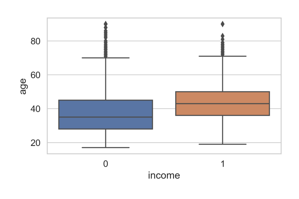
For the first chart I created a box plot to represent the relationship between age and income int he dataset.
					sns.boxplot(x='income', y='age', data=pair_plot1)
plt.tight_layout(pad=1.8)
plt.savefig('boxplot income_age.png', dpi=300);
The median age for a person making <=50K is 38 and the median for a person makeing >50K is 42.
What I gather from this is that the longer a person is in the workforce the more likely they are to make >50k. Most people who are in a carrer tend to move up in salary over time.
In the next box plot we see the relationship between education and income
					sns.boxplot(x='income', y='education num', data=pair_plot1)
plt.tight_layout(pad=1.8)
plt.savefig('boxplot income_education num.png', dpi=300);
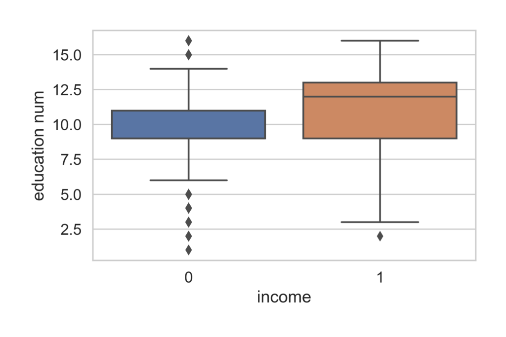
People who have a median education level of ‘some college’ are more likely to make <=50k. People with a median education level of at least an associates degree are more likely to make >50k.
Education-num key code:
1 = Preschool
2 = 1st-4th
3 = 5th-6th
4 = 7th-8th
5 = 9th
6 = 10th
7 = 11th
8 = 12th
9 = HS-grad
10 = Some-college
11 = Assoc-voc
12 = Assoc-acdm
13 = Bachelors
14 = Masters
15 = Prof-school
16 = Doctorate
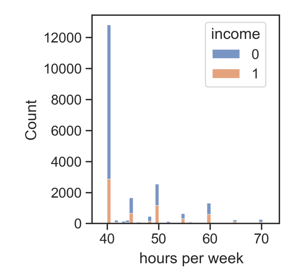
In the next chart we have a histogram of hours worked per week.
					sns.histplot(data=pair_plot1, x="hours per week", hue="income",multiple="stack")
plt.tight_layout(pad=1.8)
This shows that the majority of people working 40hrs per week make <=50k but even if a person works more than 40hrs they are not more likely to make >50k.
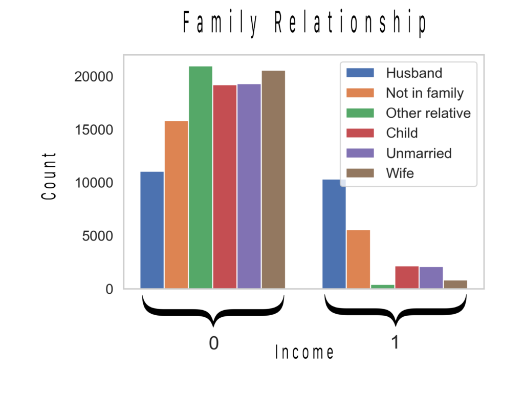
In his next chart we have a histogram of the connection between family relationship and income.
					names2 = ['Husband','Not in family','Other relative','Child', 'Unmarried','Wife']
plt.hist(hist3, bins=2)
plt.legend(names2)
plt.grid(False);
plt.tight_layout(pad=1.8)
When it comes to family relationship the husban is the least likely to make <=50k and the most likely to make >50k. The situation is flipped for the wife. ‘Other Relative’ (nephew, grandparent, etc.) in this catigory, someone not making much or any income, is the most likley out of everyone to be making <=50k and least likely to be making >50k.
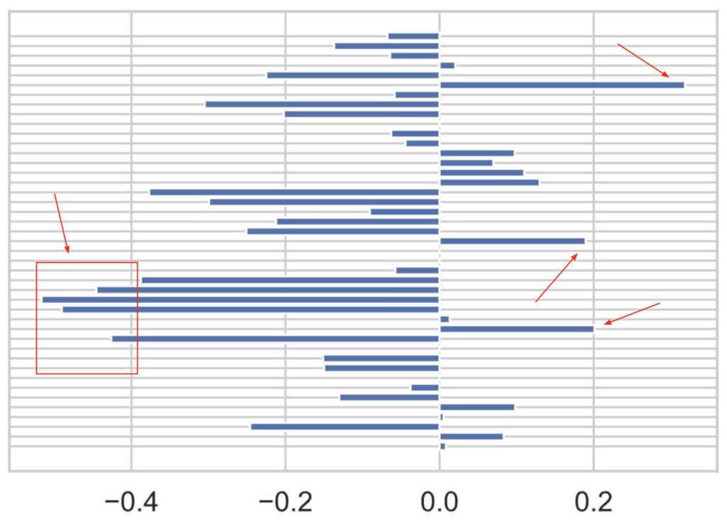
For the next chart we will take a look at the coefficient probabilities of all the features. I used the divide by 4 rule which will be explained after viewing the chart.
					# divide by 4 rule
lm1_new = lm1.coef_ / 4

a = np.squeeze(lm1_new)
					names = ['age', 'education num', 'sex', 'hours per week',
       'workclass_Federal-gov', 'workclass_Local-gov', 'workclass_Private',
       'workclass_Self-emp-inc', 'workclass_Self-emp-not-inc',
       'workclass_State-gov', 'workclass_Without-pay',
       'marital status_Divorced', 'marital status_Married-AF-spouse',
       'marital status_Married-civ-spouse',
       'marital status_Married-spouse-absent', 'marital status_Never-married',
       'marital status_Sep3arated', 'marital status_Widowed',
       'occupation_Adm-clerical', 'occupation_Armed-Forces',
       'occupation_Craft-repair', 'occupation_Exec-managerial',
       'occupation_Farming-fishing', 'occupation_Handlers-cleaners',
       'occupation_Machine-op-inspct', 'occupation_Other-service',
       'occupation_Priv-house-serv', 'occupation_Prof-specialty',
       'occupation_Protective-serv', 'occupation_Sales',
       'occupation_Tech-support', 'occupation_Transport-moving',
       'relationship_Husband', 'relationship_Not-in-family',
       'relationship_Other-relative', 'relationship_Own-child',
       'relationship_Unmarried', 'relationship_Wife',
       'race_Amer-Indian-Eskimo', 'race_Asian-Pac-Islander', 'race_Black',
       'race_Other', 'race_White']
fig = plt.figure()
plt.barh(names, a)

plt.show()
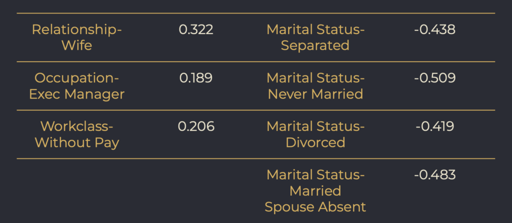
After feature engineering I was left with 43 features. Marked with the Red arrows are the standout coefficients. Below is a chart of their values.
I used the ‘divide by 4 rule’ to get my coefficients.
Interpretation using the ‘divide by 4 rule’: Using ‘Relationship- Wife’, a 1 unit increase (being a wife) will result in no more than a 32% positive difference in the probability that they will make >$50K.
All of the standout negative coefficients fall under ‘Marital Status’ (single people). What this is saying is that being single will decrease the the probability that one will make $50k by or up to 50%.
6. Modeling
I implemented several different models for this project. The data was Scaled, grid search was used to optimize hyper-parameters for Logistic Regression and implemented a Train, Validate, Test Split: 60/20/20.
I will be showing code for one of the models the others are similar in setup.
					# Train and test split, 20% for final testing
X, X_test, y, y_test = train_test_split(df_X, df_y, test_size=.2, random_state=10)

# Train and val split
X_train, X_val, y_train, y_val = train_test_split(X, y, test_size=.25, random_state=3)
					# standard scale data
scaler = StandardScaler()
X_train = scaler.fit_transform(X_train)
X_val= scaler.fit_transform(X_val)
X_test= scaler.fit_transform(X_test)
					#Optimize & define models/ hyperparameters for LogisticRegression
model = LogisticRegression(max_iter=2000)
solvers = ['liblinear']
penalty = ['l1','l2']
c_values = [100, 10, 1.0, 0.1, 0.01]

# define grid search
grid = dict(solver=solvers,penalty=penalty,C=c_values)
cv = RepeatedStratifiedKFold(n_splits=10, n_repeats=3, random_state=1)
grid_search = GridSearchCV(estimator=model, param_grid=grid, n_jobs=-1, cv=cv, scoring='accuracy',error_score=0)
grid_result = grid_search.fit(X_train, y_train)
grid_result.best_params_

# summarize
print('Mean Accuracy: %.3f' % grid_result.best_score_)
print('Config: %s' % grid_result.best_params_)
Mean Accuracy: 0.803
Config: {'C': 1.0, 'penalty': 'l1', 'solver': 'liblinear'}
					# Simple LogisticRegression
lm2 = LogisticRegression(penalty= 'l1', C=1, max_iter=2000, solver='liblinear').fit(X_train, y_train)
print('Score on train: %.3f' % \
lm2.score(X_train, y_train))
Score on train: 0.803
					print('Score on val: %.3f' % \
lm2.score(X_val, y_val))
Score on val: 0.802
					print('Simple Logistic Regression train F1: %.3f' % \
      (f1_score(y_train, lm2.predict(X_train))))
print('Simple Logistic Regression val F1: %.3f' % \
      (f1_score(y_val, lm2.predict(X_val))))
Simple Logistic Regression train F1: 0.649
Simple Logistic Regression val F1: 0.641
Below is a chart of scores for all of the models prior to the final model.
I chose to go with Logistic Regression for the final model.
					#final model Test
print('Accuracy Score on test: %.3f' % \
lm2.score(X_test, y_test))
print('Logistic Regression Test Data F1: %.3f' % \
      (f1_score(y_test, lm2.predict(X_test))))
Accuracy Score on test: 0.796
Logistic Regression Test Data F1: 0.614
7. Recommendations
Based off of my findings my recommendations to ‘Grow Smart’ would be:
- Look into targeting and helping people under the median age of 38.
- Work out how to best help people reach at least 2 years of college to gain an associates degree.
- Look into targeting wives for the program and look deeper into the ‘Other Relative’ category and how best to assist those demographics.
- Look into strategies for targeting and helping individuals that are single within the ‘Marital Status’ category.


